“My Fellow Citizens…”
Masters Thesis for M.Sc. Data Visualization at Parsons School of Design
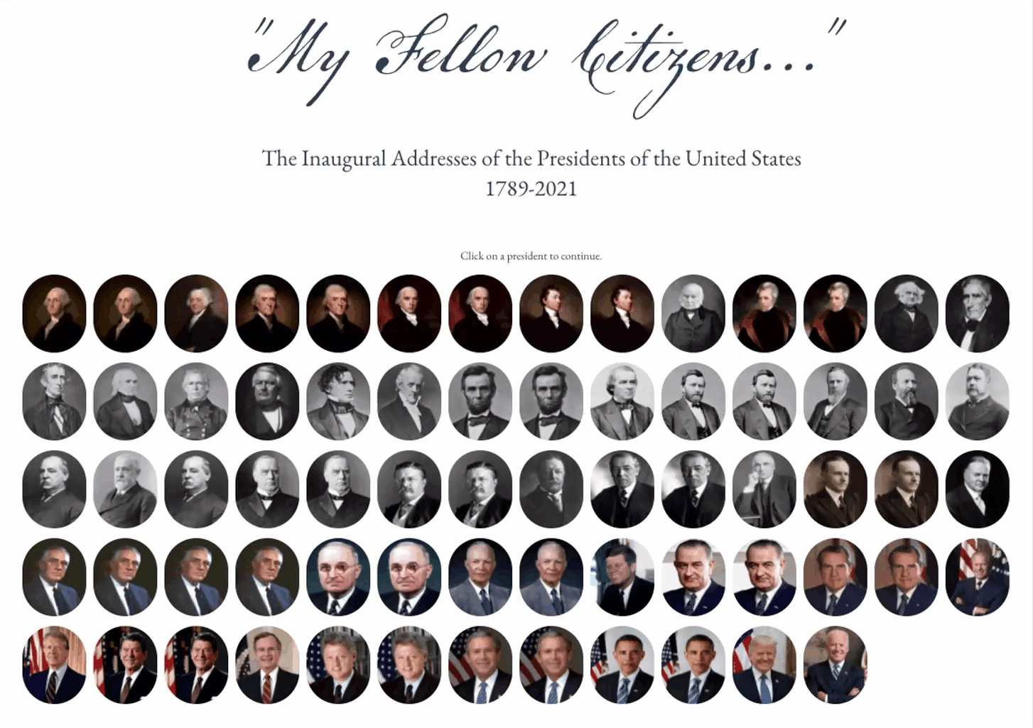
What makes a speech “great”? Only a few presidential inaugural addresses have been considered truly exceptional political speech by historians. Are these historians correct?
“My Fellow Citizens…” explores the combination of the traditional liberal arts with the comparatively modern field of data visualization. The project attempts to demonstrate that a historical corpus of text, analyzed using natural language processes, and visualized through modern data visualization methods can facilitate understanding, reveal & generate new insights, and allow for a fuller appreciation of the texts.


Ideation & Analytics
Having spent years analyzing financial & health data, I really wanted to challenge myself by starting with a concept where the data set wouldn’t be obvious or pre-determined by someone else. With interests in both history and typography, I thought of starting with texts, that could be analyzed & further contextualized. Inspired by Richard Brath’s work on text visualizaion, I wanted to more deeply explore text as interface and aim for a high, but not overwhelming cognitive load.
-

The project started using only the speech text themselves as the data set. The speeches themselves were tone analyzed, while other contextual data sets were assembled from from historical events and historian analysis.
-

K-means clustering provides new perspective by grouping speeches with similar qualities together.
-

R statistical software helps to shed light on results interpretation. Here we see how tonal factors influenced placement in one of the included scatterplots.
Design Cues
For this work I wanted it to feel modern, but with some hints that would help the design span the 200+ years of content that it addresses. I chose a simplified eagle logo, rather than the more official but busy & detailed presidential seal. For the opening title, I chose a font to resemble George Washington’s surviving copy of the first inaugural address. The beige and grey background tones, are punctuated by simple black and red highlights, and allows the historical content to take a primary focus for the audience.
-

1789 Vintage
From the original handwritten copy of George Washington’s first inaugural address.
-

2014 Interpretation
Remsen Script from Montotype Imaging.
This project was done as part of Parsons School of Design M.Sc. in Data Visualization.